
Responsive design in the Dynamics 365 Marketing email canvas

Today, UX, or user experience, is paramount to the effectiveness of your marketing efforts—but it’s never been more nuanced and dynamic. Not only do we have more people we can reach with our message (with the whole internet at our fingertips), but we also have a vast variety of methods through which your audience will witness your messages.
Take an email. How, when, and where do you normally view your emails? Is it on your desktop computer? A laptop? Tablet? How about your phone? Most people will probably say they check their email on many devices. So the challenge becomes how we make sure as many of our audience members as possible have a good experience viewing our email. Of course, we want the message to be relevant to them (but that’s a whole other can of worms), and we want the message to look great, no matter where it’s being seen. Enter responsive design.
Responsive design is the design and development approach where creators consider and adjust their web-based content (like emails and websites) to consider the size and layout of the device it will be viewed on and adapt accordingly. The goal is for your web content to render to provide an optimal experience—usability, navigation, visual appeal—no matter the size of a user’s screen size.
In today’s outbound marketing, we must consider mobile-friendly design when planning our email campaigns, but we also cannot forget the desktop experience. Dynamics 365 Marketing has recently added further responsive design options to help your emails flux based on the device it’s being viewed on.
Responsive design in the email canvas
Within the email canvas, you can find you responsive design settings within the “Section” settings. You won’t be able to influence the responsive design in the “Column” settings or within the individual “Element” boxes. (Elements are things like buttons, text boxes, or images that sit within columns.)

Swap between element, column, and section settings in the top right corner of the blue box surrounding that item.
To swap between Element, Column, and Section settings, click into the part of the email you want to adjust. A blue box will appear around that area of the email with settings in the top left of that box. You can tell where you are by looking at the first box in these settings. In the example below, I’m in the “Image” element box. Select the dropdown carrot here, and you can choose the Column or Section. The panel to the right of the canvas will change depending on which layer you choose.
When you define the Section layer, these are the options you have for editing. You can adjust the columns and layout of the section, the background, the style, the spacing, and finally, or topic of the day: Responsive design. Responsive design is set on the section-level rather than for the whole email to allow more flexibility in how each part of your email presents on different screens.
Emails you create in Dynamics 365 Marketing are built with drag-and-drop elements that build the HTML for the email (which you can view by clicking into the HTML just below the “Go live” button in the image below). And the code for these emails do already include some responsive design, but these settings within the Responsive design tab allow you further customization. Let’s look at each one, starting at the bottom.

Within the “Edit layout” tab for Sections, you can find the Responsive design options.
The “Show on desktop” and “Show on mobile” options allow you to create entire sections for either desktop, mobile, or both. You’ll see both in the designer canvas, which may feel a little strange, but when you preview the email, you’ll see only the sections you’ve identified for desktop on the desktop previews, while you’ll see only the sections you’ve set to show up on mobile for mobile previews.
These settings are excellent if you want to completely redesign a section for both desktop and mobile views. This is ideal if you don’t want to or cannot adjust the section to work well in both mobile and desktop views without sacrificing the user experience in one or the other.
Next up on this list of responsive design options is to “Set equal height for columns,” the title of which seems to speak for itself. Each column within that section will be of equal height.
Finally, we can “Wrap columns on mobile,” which will, if the section includes more than one column, will force each column to appear one after the other down the page rather than side-by-side. This format goes from left to right, and this adjustment is particularly helpful when viewing on mobile portrait view. Let’s look at how turning on or off the wrapped columns will impact the view on a mobile phone (it will not impact your desktop view).
We highly suggest wrapping columns on mobile if you have two or more columns in order to offer even those audience members viewing your email with the least horizontal space a strong viewing experience.
Desktop
(600 px layout max width)
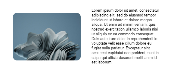
Desktop view of an email containing a 2-column section. One column includes an image, the other contains text. This email has a 600px layout max width.
Mobile Portrait
(Wrapped vs unwrapped columns)

Responsive design “Wrapped column” is turned on in this mobile portrait view of an email containing a 2-column section. One column contains an image, the other text.

Responsive design “Wrapped column” is turned off in this mobile portrait view of an email containing a 2-column section. One column contains an image, the other text.
Mobile Landscape
(Wrapped vs unwrapped columns)

The Responsive design “wrapped column” setting is turned on in this mobile landscape view of an email with 2 columns.

The Responsive design “wrapped column” setting is turned off in this mobile landscape view of an email with 2 columns.
Previews and test sends
The “Preview and test” tab allows you to see how the email will look across several screen sizes and email clients.
In terms of responsive design, your ability to preview desktop vs mobile rendering is particularly important. You’ll be able to really see the value of turning on the “wrap columns” option we discussed before, and you can ensure that sections you set to only appear on desktop or mobile truly do not appear where you don’t want them to.

The “Preview and test” tab is at the top left corner of the screen and, once you’re in the view, you can review each screen size - from standard desktop to tablet and mobile portrait and landscape views. In addition, you can view previews in various email client.
A little removed from responsive design, but still included in this “Preview and test” tab are email client previews are provided by Litmus, and your organization gets 1,000 previews per month as part of your Dynamics 365 Marketing licenses, but you can purchase more. You can see exactly how your email will render across the locations you believe your audience will be receiving it within—like Gmail in Chrome, Outlook i0S, Outlook 2016 in Windows 10, and more.
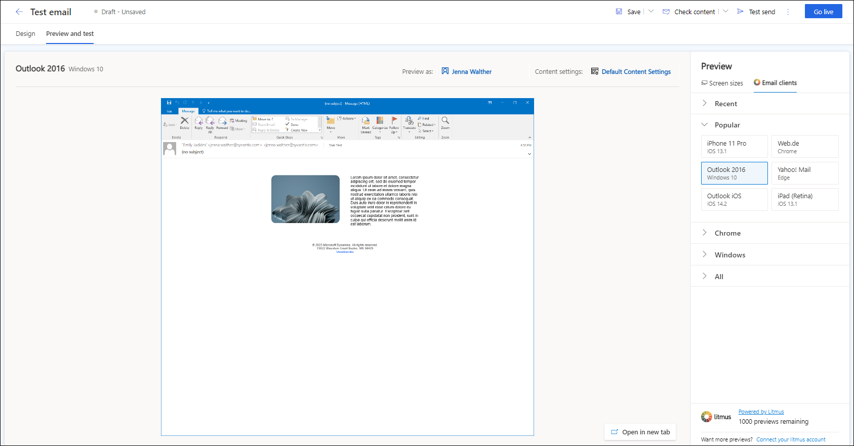
An example of a Litmus email client preview: Outlook 2016 on Windows 10.
Finally, you can also use the “Test send” feature in the top navigation ribbon to see what the email will look like within yours or another coworker’s inbox. You can hop into your phone email to see what it looks like, then return to your desktop to view those differences, as well. This will allow you to see any dynamic content you have within your email, too.

The test send feature is in the top navigation ribbon.
Responsive design is a given in today’s marketing strategy. If you want more info about responsive design capabilities within the Dynamics 365 Marketing app, or general training for this app, connect with us! We’re happy to help.