
Analyze Dynamics 365 Marketing campaign performance with interactive Power BI reports

Dynamics 365 Marketing is a powerful digital marketing application that help users create marking content and distribute it manually or through automated processes. Its wide variety of tools make it effective for most marketing campaigns. Dynamics 365 Marketing has its own insights and analytics tools to help marketers learn what has proved effective and what can be improved. However, with the use of Azure Blob storage and Power BI, interactive, highly customizable reports can be created to boost the visibility of important marketing data. Power BI is also a low-code solution, so, while coding knowledge can be helpful, an extensive background in development is not needed to make effective, good-looking reports.
By setting up Azure Blob storage and connecting it to Dynamics 365 Marketing, the connected data can be accessed In Power BI. There are two types of data sources for Marketing that can be connected. Profile Data from the organizational database that includes the entities as seen in Marketing such as contacts, leads, accounts, and customer journeys. Interaction data is pulled from the marketing-insights database and data related to how contacts interact with content in Dynamics 365 Marketing. This includes data points such as email opens and clicks, registrations for events, and page or form submissions. This data is available to be seen within Marketing but can’t be viewed and used in the same way as within Power BI.
Report templates
With the vast amount of customizability in Power BI, it can be a bit daunting to decide which data to use and how they should be displayed. Luckily, there is a library of report templates and samples available to download and try out. From our experience working with Power BI, it works best to look through the sample reports and decide which visualizations fit best for the data included in the report. Then, when loading the template, delete everything except the desired visualizations.
The Generic Template is targeted towards those who are more experienced with report creation in Power BI. It lays out a baseline framework for reporting marketing analytics with queries, functions, parameters, and data connectors. While it is targeted at experienced users, it can still be a good learning tool. By just being a framework, it helps to show specifically how the various connectors can be set up.
The Basic Leaderboard Report examines customer journeys and email marketing efforts. It shows which journeys and messages are proving to be the most effective. It includes KPIs such as total email deliveries, email opens, link clicks, form submissions, and subscriptions. Customer journey rankings also include how many contacts went through the journey. It also has various filters set up that can be used to change date ranges and statuses.

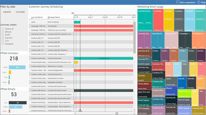
There is another Email Marketing Report used to dive a bit more into email marketing than the Basic Leaderboard Report. The left side of this report has a wide variety of filters that can be applied to show data based on dates, journeys, status, and by message. The marketing plan view shows a Gantt chart of marketing activities. This includes a graph to show how often each email message is used within a journey. The template used report shows how the marketing automation is using each email template. The template also includes a timeline of email interactions, a geographical map of message interactions, and a link click report.
The Segmentation Usage template is an examination of marketing segments. It includes details of which segments are most used and which customer journeys are making use of the segments. This report can help determine segments that are potentially being underutilized, or that can be removed for data cleanup purposes.

With the Marketing Program Effectiveness Report, full marketing programs can be analyzed. This includes all automation, channels, journeys, lead generation and conversion, and revenue generation. Each detail from the initial plan to examining ROI. The home page shows a general overview of marketing activities with filters to switch things like time frames. The marketing plan page gives a Gantt chart of currently running customer journeys and marketing messages. The other pages are the leaderboard for activity performance, lead generation with where leads are coming in from, the lead pipeline with all leads and their current stages, and the return-on-investment report to track budgets and revenue.

Data bloat
As mentioned earlier, it is a good idea to look through the sample reports of each template before diving in. Decide what visualizations work for the needed data. This becomes even more necessary for Marketing users with large amounts of emails, journeys, and contacts. Pulling in such large amounts of data can cause large slowdowns in load times. Be sure to be as specific as possible when planning which data should appear and remove any extraneous data points from the template. When the reports are finished and published, automatic data refresh is turned on. This nullifies any data update slowdowns that may be present when initially designing the report.
Power BI is a powerful data visualization tool and is effective in displaying marketing activity data from Dynamics 365 Marketing. If you are interested in how Power BI, Dynamics 365 Marketing, and other Microsoft business applications can help your business get in touch with us to get started.